
How to make perfect Product Renders

Before creating HDR Light Studio, my own background was in product design with expertise in 3d product visualization for my clients. From my own personal experience here are my tips for the ideal process to follow in creating realistic 3D images of products that customers and product marketers will find hard to tell apart from a photograph.
These tips must be applied in the order they are listed below.
The foundation for a great product render is an accurate 3D model
However much effort you put into the visualization process - if the 3D model you are rendering is inaccurate and has imperfections, then the final rendering will not be photo realistic.
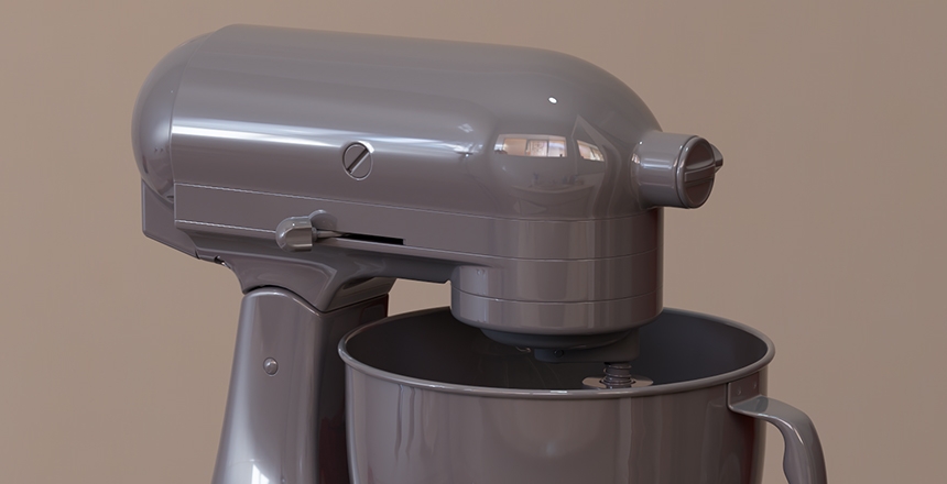
Imagine you have made a physical model of a new product in real life and you spray it in chrome paint. Any imperfections in your model are amplified by the chrome finish and 100 times more obvious. Once you start applying materials and lighting in your 3D software - the same is true, the problems are highlighted and not hidden.
So hopefully, you have a CAD file for the product design and the file has translated well into your 3D rendering software. The CAD model will include fillets (rounding) on the edges and will include all of the little details in the design that will make the render realistic. If you don't have CAD data and are modeling the product yourself - it will be the lack of those details that make your image unrealistic.
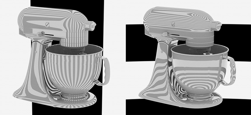
Once you have your 3D model in your rendering software, at this early stage it's best to assign a glossy material to the whole model and rotate your view around it to try and discover any issues with the geometry. You can not see problems easily in a shaded viewport, you will need to render the scene in your final renderer to see the issues.
Surround the scene with an HDRI map, so that the reflections moving over your surfaces will help reveal geometry problems. Vertical and horizontal zebra stripe HDRI maps are good for this.
Once you are happy with the 3D model of the product, move to the next step.
You need accurate materials that react correctly to light and reflections
However well you light the scene, later on, you can't light your way out of bad materials (believe me, I have tried). The materials you apply need to represent the surface finishes of the end products accurately.
At first, why not develop your materials on a simple scene with HDRI lighting on some balls? This allows you to quickly develop the appearance of the materials without being bogged down by rendering the whole final scene... which will be slower and distract from the task of making accurate materials.
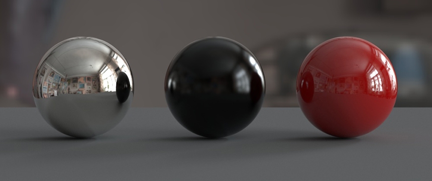
Once you are happy with the materials, you can apply them to the final product model and develop the look of the materials further by rendering the scene with different lighting and reflection conditions using HDRI environments.
If you refine your materials using only one lighting setup, it is very easy to create materials that are not reacting properly to the light.
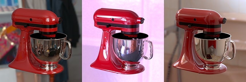
Important settings on any shader are the base color, how reflective the material is and how rough the surface is... so whether reflections are perfect and mirror-like or spread as you see on a satin surface. There are many more parameters, too many to go into here, and mastering material settings is key to producing a great final image.
Once you have tested the applied materials in a wide range of lighting environments and are happy the materials are reacting properly to the light... you are now ready to start the more creative parts of the product rendering process.
So far the process has not been creative but technical. You have completed the digital equivalent of making a real-world prototype. Now the virtual product is complete, it's ready for virtual photography.
Take your time and perfect the final shot composition
Here's where things get creative... at last. From this point onwards, we need to work like a photographer - we are now making computer-generated photographs. We first need to understand the job that the renders we produce need to do for our client. This will dictate our approach.
For example, if we are rendering images to present at a design review, the images need to clearly communicate the form and materials of the products without distractions. We should create a selection of camera views of the product that clearly show its features and form.
We should choose a field of view for the camera that doesn't distort the product in a dramatic way - but feels natural. These types of renders are not creative as such, but informative. A number of detail shots will also be needed to focus on key features of the design elements.
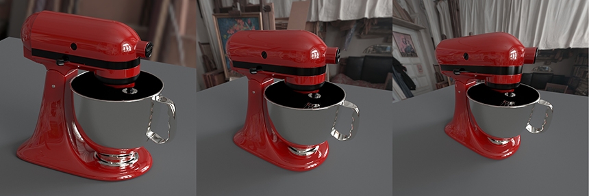
If you were producing design visuals to use in websites and catalogs, again, these will need a similar approach. Mostly requiring a clean shot on a white background.
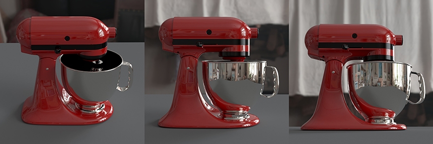
Sometimes there will be more creative briefs where we need dynamic images of the product in an environment where it would be used. It could be a hero image for packaging or advertising. We still need to clearly show the product in these shots, but we have a little more license to play with the field of view for the camera and position the camera for a more dynamic perspective.
At this point, you will have some generic lighting for the scene from an HDRI map. Only when the camera angles have been approved by your customer should you light the shots. This is because if the customer changes the camera position, then the reflections of your lights will move and the shot will need re-lighting.
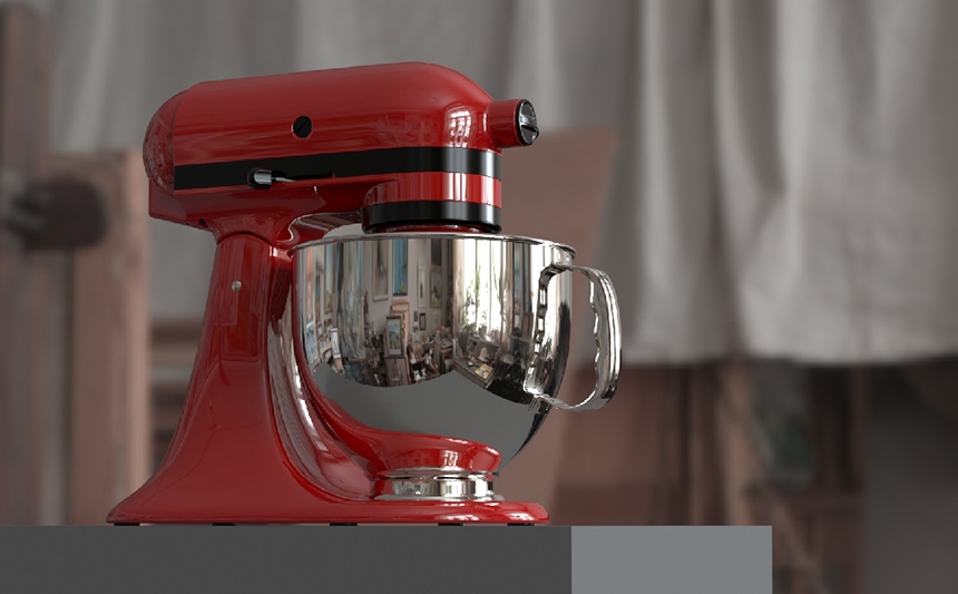
Now for the most creative and important part of the product render process - Lighting
Lighting is the most creative part of the product render process. Lighting has the power to totally transform the mood and feel of the final image. Lighting can add drama to your hero shots and lighting can be used to highlight product details and reveal the materials.
Lighting is so underrated in its power to transform an image and often 3D artists do not spend enough time on this part of the process. Great lighting makes the difference between an average and an amazing image.
My general tips for lighting product shots are:
Photographic Reference
If you are lighting a studio shot, use image references of how the same type of shot has been lit in real studio photography. This is the benchmark by which your image will be judged. Try to use the same studio light types from the reference - and if the lighting can be clearly seen in reflections, make sure you replicate the light appearances. You may need to use HDR textures on your area lights to make them more realistic.

Keep It Simple
Keep the lighting as simple as possible. It's so easy to get carried away and end up with too many lights. You want to place a few well-considered lights - with each light doing a very specific job in the render. Solo each light to check its effect on the scene.
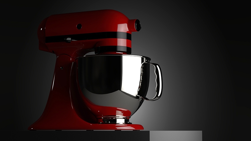
Follow the form
Use lighting that is in sympathy with the shape of the product and follows its form. Do not use lights that fight against the flow of the shape of the product. The lighting should help you understand the shape of the object.
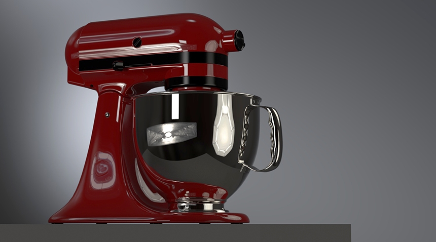
Communicate materials
Use lighting to communicate material finishes and make them easy to understand. Sometimes the only way you can tell a surface is glossy is because you see a hard-edged reflection of a light source. Or if a material changes from gloss to satin, you notice this because the reflection of the light changes from mirror-like to then spread and be blurry.
Review your lighting
Once you are happy with the lighting, view the image small at thumbnail size to check you can read the overall form of the product. Also, flip the image horizontally and see if you are still happy with what it looks like. Sometimes, we get so engrossed in lighting a design element or detail, that we forget the big picture and the overall impression the lighting provides.
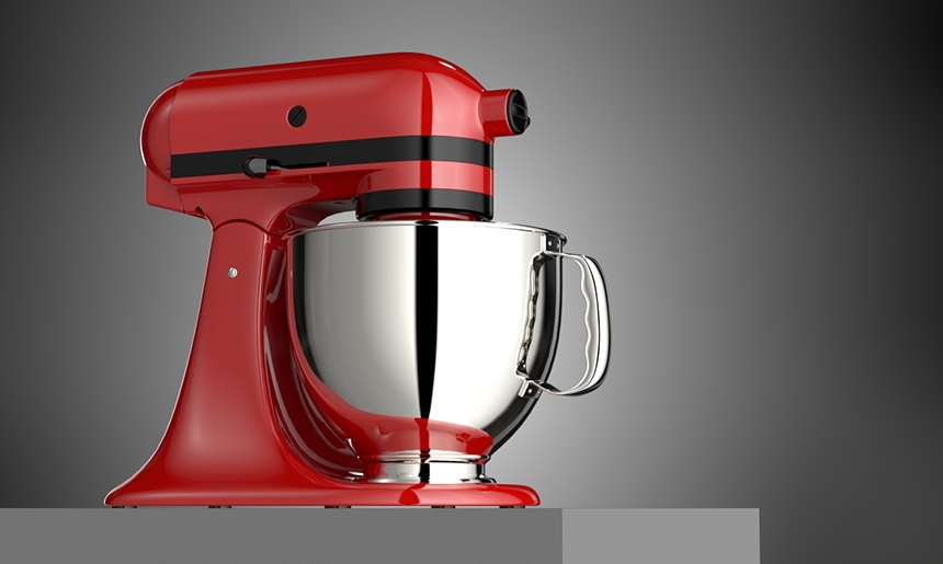
Finally a great product render
If you have got this far in the render process and are happy with each stage, you should have produced some high-quality renders that your client will love.
We hope this article has helped you if you are a 3D artist or if you are looking for 3d product rendering services to showcase your product and wanted to understand the product rendering process in more detail.
This entry was posted in and tagged Industry: Product.


