CGI Studio Lighting Tips

The Power of Great Studio Lighting
Lighting makes a huge difference to the look and feel of any 3D rendering. Your 3D model took a lot of hard work to build and now deserves to be seen in its best light.
However, lighting is often undervalued by 3D artists and it's not easy to find trustworthy resources to teach the art of lighting to 3D artists. So I've put together my personal top 5 tips that I feel will help artists avoid common 3d lighting mistakes and will help to ensure a well-lit studio shot.
Model and Materials correct before Lighting
If your model and/or materials are not right, the lighting process actually highlights these errors even more and it will be impossible to create a realistic computer-generated image.
Modeling
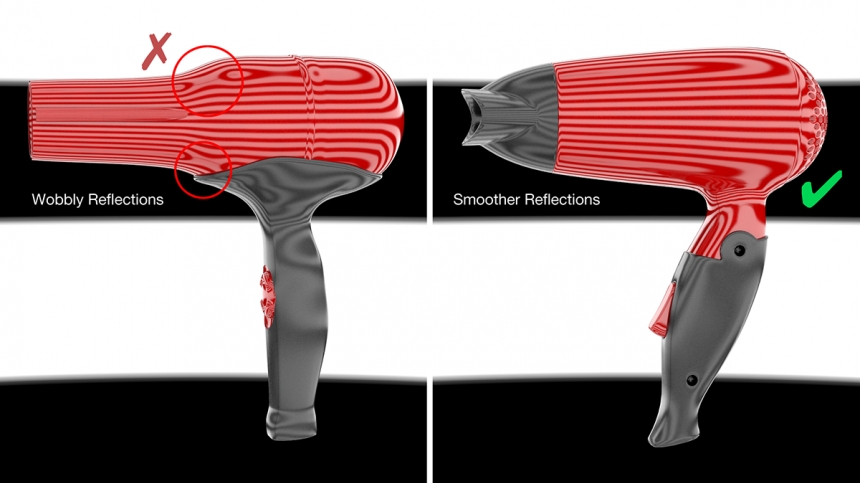
You can be fooled into thinking the model looks great in the viewport in your 3D rendering software. Try checking your model inside a zebra-striped HDRI map to see how those lines are reflected in the surfaces. Render the model at different angles and see if you can spot any obvious problems.
Look for strange wobbly reflections, this reveals that the modeled surface is not as smooth as you thought. Fix any modeling problems now, as they will only appear worse in final lighting setups.
Materials
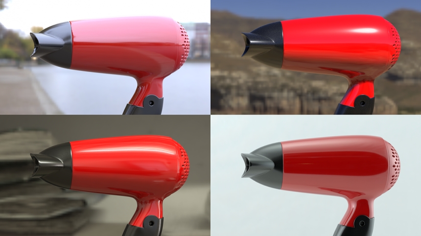
If the materials are not physically correct, they will react incorrectly to the illumination and reflections coming from your lighting. This will make the scene harder to light and it will never look realistic. Try testing your model lit in a variety of HDRI environments first - studios, indoor and outdoor environments. Does chrome look like chrome, does metallic paint look correct? How are the materials balancing with each other under these different lighting conditions? Basically, does it look real? This is called 'Look Development'.
If you don't get the materials correct now, you will need to keep tweaking them during the lighting process. You may even need to adjust the materials for different camera angles, which is a really bad idea. It makes sense to get the materials right first, lighting will then be far easier to do.
Light Sources with Character
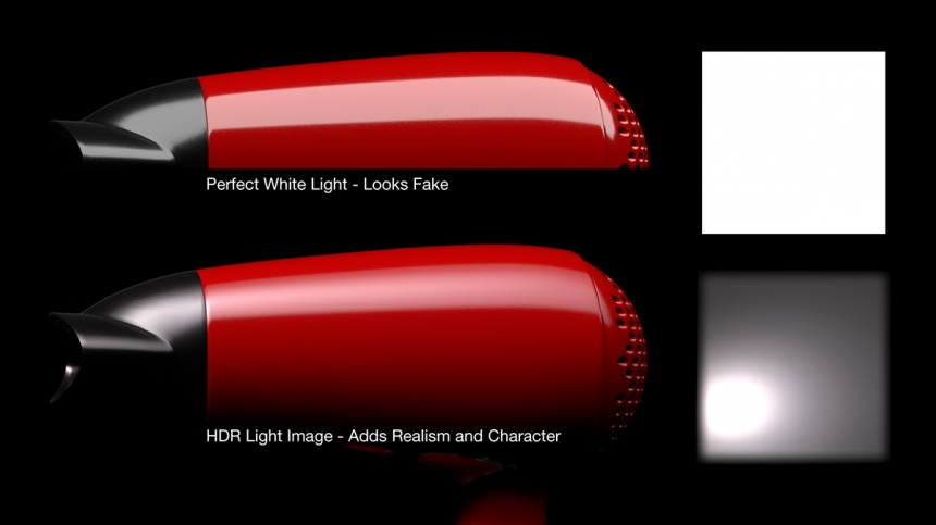
The appearance of lights seen reflecting in your 3D model really matters. A perfect white rectangle with hard edges (just like a standard out-of-the-box area light in your 3D software), will look fake and will make your render look 'cartoony'.
Real-world lights have a shape and often hot spots where the light is brightest and graduates away. Real lights have character and include imperfections too. 3D artists already know the importance of texturing their models to make them look realistic, the same goes for lights.
A library of HDR light source images to map to your area lights is ideal, or at least use gradients in your 3D software to create a visually interesting light appearance.
Lights Reveal Materials and Form
Off-the-shelf HDRI lighting setups are too generic when it comes to lighting products. For a great result you need to perfectly position each light and precisely control its appearance... but why? To reveal the materials and form of the product. Let's explain why...
Use Lights to Reveal Materials
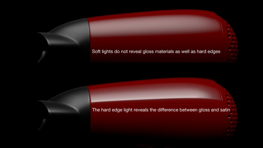
The product being lit is most likely made from different materials and surface finishes. If the same light is reflecting across a change in material, then the reflection will help to show what the material finishes are.
In product shots, you often see lights with a hard edge are used to reflect across the product and show which parts are smooth and which are rough. The edge remains sharp when seen in chrome or glass, like a phone screen for example, and then the reflection spreads on materials with a more textured finish like satin metal or textured plastic.
Choose light appearances and positioning that help to showcase the different materials. Remember producing a product shot is about visually communicating the product to the viewer - so they understand the design.
Use Lights to Reveal Form
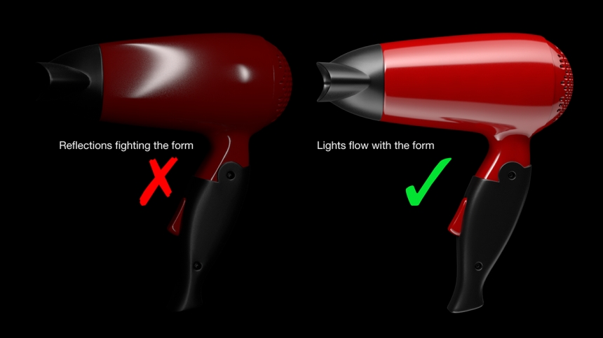
The form is the 3D shape of the object. Lighting should help to communicate the form. Reflections of lights should flow in the direction of the form and not fight against this. If a light goes in the opposite direction it will look like a strange 'stripe' or a 'spot' on the product.
Avoid Unwanted Reflections
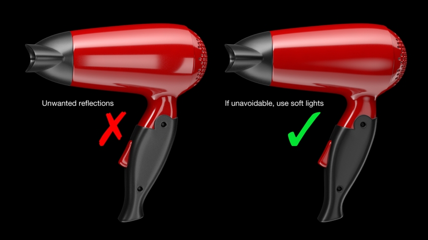
Sometimes you will place a light in a position that creates a really great illumination or reflection effect - then only to see it also creates another awful, unwanted effect somewhere else on the model. You should reposition the light to avoid these unwanted effects.
But sometimes this is unavoidable, so in those cases try using a softer light appearance, these are much more forgiving when seen in the reflections.
Keep Studio Lighting Simple
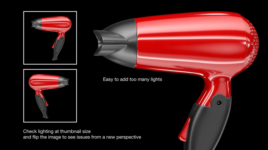
You can't run out of lights using 3D software, so it’s easy to create way too many lights. In a real photography studio, a handful of well-placed lights will be used, each added for a very specific effect.
So when lighting your shot, research how others have lit the same type of product when photographing them, and use these images for reference. It's easy to work out what type of lights have been used by looking at the reflections.
Many successful 3D artists have learned to light by using reference images this way. Remember photography is the benchmark by which we all judge the CGI product shot, so we can learn a lot from photographs when making computer-generated imagery.
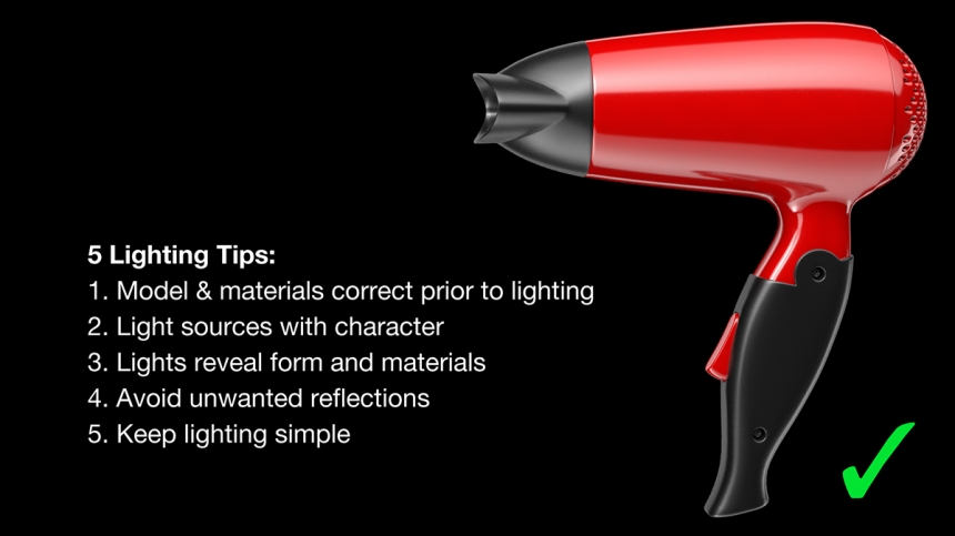
Follow these 5 tips and your studio lighting should look good:
Judging the final studio lighting
Once you are happy with the studio lighting setup and feel it is complete, look at your render as a small thumbnail, it should still look good. What do I mean by 'good'? You should be able to easily recognize the form and materials, and the lighting should not overpower or be adding distracting levels of detail.
It's too easy to focus on lighting one small area and forget the overall feel of the image. If the image looks strange as a small thumbnail, then you probably need to simplify the lighting. Another trick is to flip your image horizontally and see if it still looks good. This provides a fresh perspective on the image and this can reveal new issues with the studio lighting you couldn't see before.
This entry was posted in Tips.


