Product 3D Lighting Tutorial
By Marius Wilkens-Zimmermann
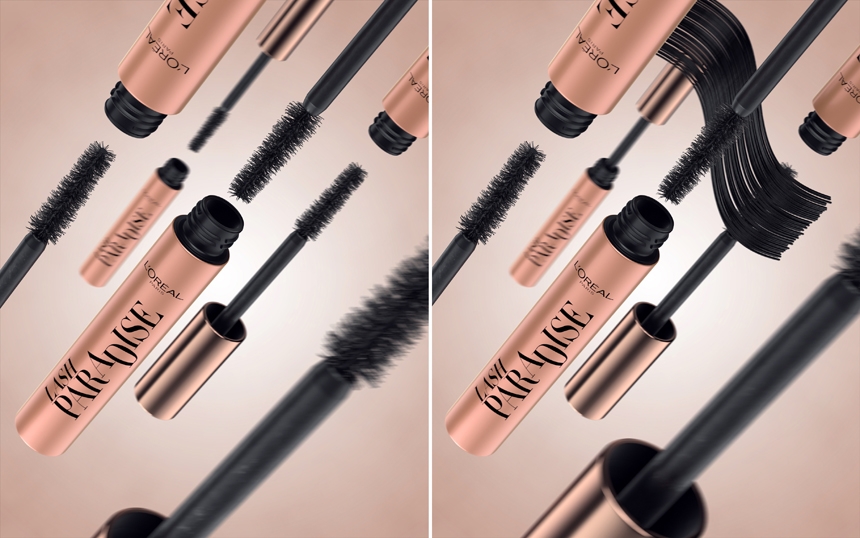
The 3D scene for this project is created in Cinema 4D with Octane render. But the lighting approach in HDR Light Studio remains the same for 3d artists whatever 3d software you are using.
I am creating a 360 HDRI map from scratch without any other lights inside Cinema 4D. The only light source will be the environment light from HDR Light Studio. The scene already has all materials and the camera set up. It's ready to light.
Via HDR Light Studio's Cinema 4D plugin, I export my scene into HDR Light Studio's own render view, this allows me to quickly position lights. I also stream the Octane interactive render into HDR Light Studio for a live reference of the final lighting results.
My goals for the 3D lighting
I want a clean and sharp lighting setup to highlight the characteristics of the products’ surfaces without distracting from the copy/branding.
The light setup has to be created in an efficient manner, and as this will result in an animation, I want the frames to render fast. I don’t want to blend multiple different render sets together in post-production.
Before I begin lighting a product I carefully analyze the surface and product structure. For this mascara stick, we have a rough reflecting base metallic surface with a glossy overlay, almost like a car paint surface. It is important to create as much 3D depth as possible with the lighting.
Gradient lights for cylindrical products
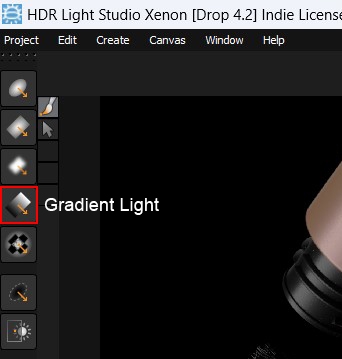
My first step is adding and positioning/rotating a gradient light to give the cylindrical shape some depth. The light has sharp edges to highlight the glossy lacquer/varnish. This is probably the most important part of bringing small products to life and making them look expensive and real.
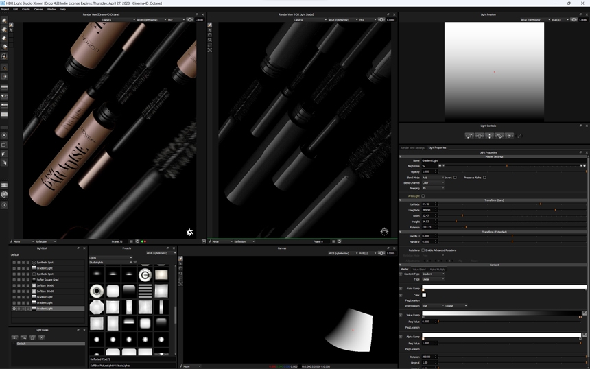
For my lights in this scene, I use the default 'add' blend mode. All the lights have the default 3D mapping. The background is empty and black.
Now that I created the main key light I am adding two additional gradient lights. These lights are almost symmetrically placed on the left and right sides of the cylindrical shape. I am intentionally leaving dark edges on the outside of the product as the background of the final shot will be bright. This separates the product from the background and creates additional volume and sharpness in the final image.
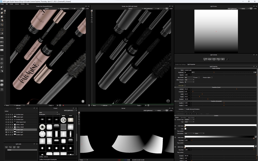
Photographic softboxes add imperfections
The reason why most renders look flat and unrealistic is the fact that we lack imperfection. So far we only placed synthetic light sources, these give us a perfect but unnatural look.
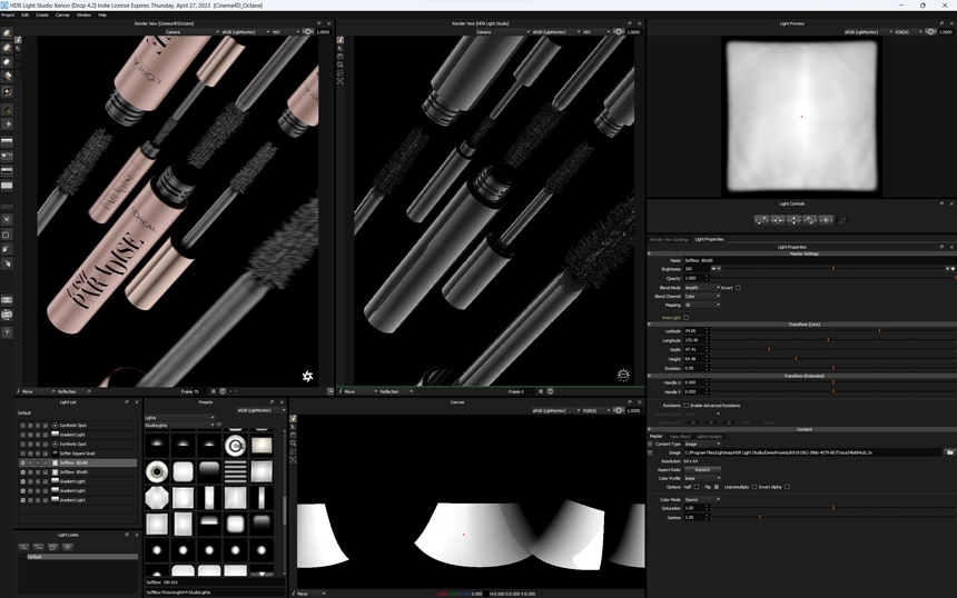
In this step, I am selecting a softbox light from the Preset library. I place two of these light sources over a large part of the already existing lights using the blend mode 'amplify'. This provides a subtle random overlay to the synthetic lights. We barely see this effect in the final render, but we would notice something missing if we didn't add this interesting 'character' to the lighting.
Adding top lighting to bring brushes alive
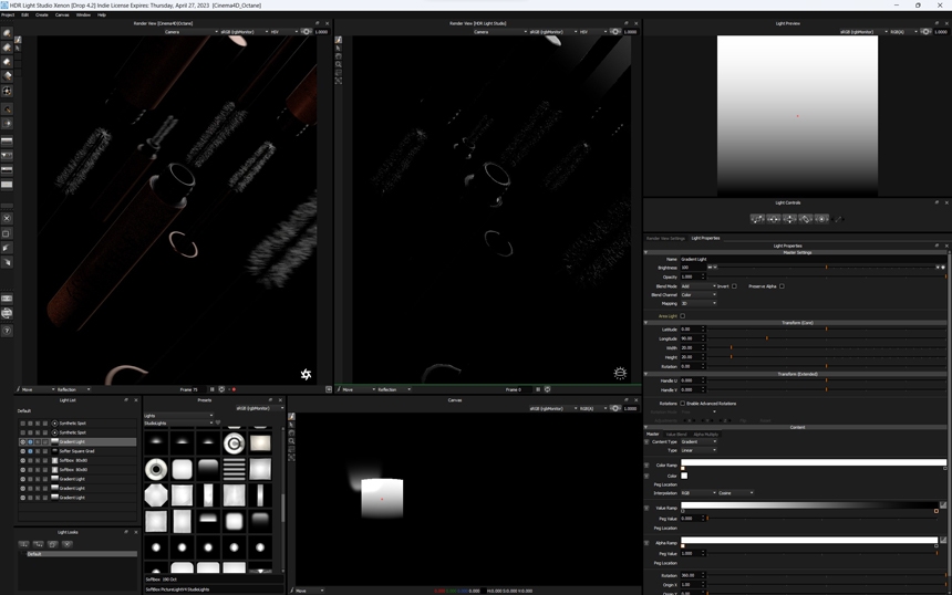
I have covered the lights shaping the cylindrical product. I now focus on the top of the product. I am using a soft and a sharp gradient light blended together. These lights are important to highlight the brush bristles. We need to show a lot of volume and detail on this part of the product.
Highlights for top and bottom edges
For the bottom edge and for the beveled edge on the top of the product I add two synthetic spotlights, that use the bulb content type in HDR Light Studio. These lights also give a little fill effect on the darker parts of the scene.
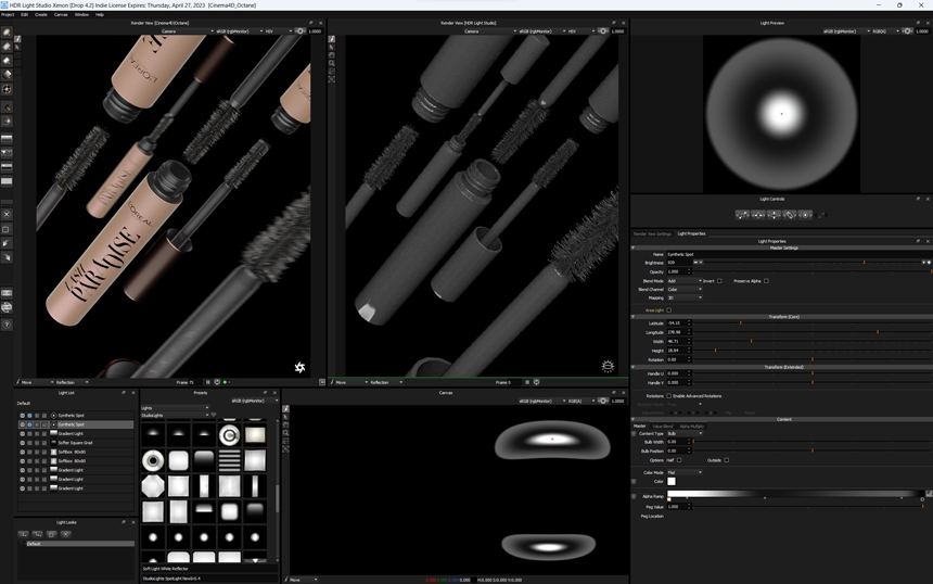
I enjoy using the bulb light type with the gradient control, as this offers defined edges on the outside with a gradient towards the inside and a small bright spotlight in the middle. This gives me a sharp contrast on the edges. Useful for adding more depth. The gradients can easily be modified with the graph editor.
Soloing lights
While setting up this scene I always isolate individual lights to see their effect on the overall result. I don’t want them to affect other areas that I have lit carefully before. Even though this is a straightforward scene, it can get confusing having multiple lights overlapping and affecting each other. HDR Light Studio manages this very well and gives very useful features outside of the physical possibilities in the real photo studio.
Final lighting thoughts
In general, I don’t want to max out on contrast just yet, for that reason the render intentionally looks a bit flat. In post-production, I want as much flexibility as possible to play with contrast and brightness. So for now I absolutely avoid any parts of the product being over or underexposed.
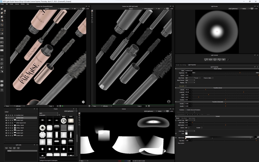
Once I am satisfied with my lighting I export the final HDRI as an EXR file. There are no further adjustments necessary, but it would be possible to adjust brightness or gamma and strength settings inside Cinema 4D if needed.
If I had perfect glossy surfaces I would choose a higher resolution for the HDRI map to avoid pixelation in reflections. But as we have mostly rough reflections I can accelerate the workflow by rendering a relatively low-resolution HDRI map.
I hope you like the final result.
You can see more of Marius's work at his website.
This entry was posted in Lighting Tutorials and Demos and tagged Cinema 4D, Octane.


